“I love taking things that are dark and disturbing and making them beautiful.” Kate O’Hara
“Looking closer, Lorimer saw that at the centre of each flower was an eye, some of which were shedding tears of blood. From a distance, these tears looked like petals. The effect was most unsettling.” Through the Flowers, published in Popshot Magazine A/W 2015.


All images from kate-ohara.com. Copyright Kate O’Hara.
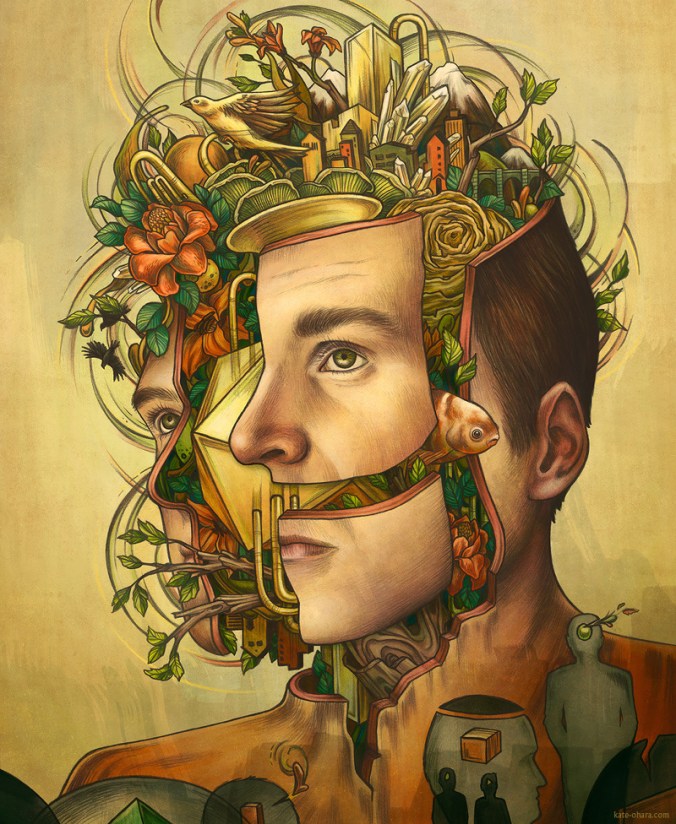
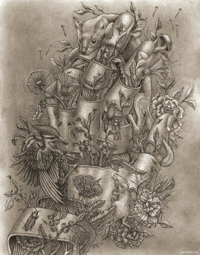
A three-eyed crow perched on a twisted bough. Among poppies and thistles, a white rabbit, scrawny and seemingly dead, lies above it’s own skeleton, the bones surrounded by questing roots and worms. A human head, coming apart in sections, to reveal the frantic but alluring world within: a fish, a bridge, musical instruments, geometric forms, plants, insects, birds, mountains, flowers, fruits. A bouquet of carnivorous plants. A dog bounding over a rhinoceros. Capuchin monkeys exploring or observing a human skull. Beetles emerging from a candle. Malevolent birds and busy insects. Curling, thrusting plants.
A Kate O’Hara illustration invariably demands a second look. The thrill of the initial impression gives way to measured inspection. One peers in – or is pulled in – and begins to relish every remarkable detail. Her work is intricate, full of idiosyncratic motifs and odd juxtapositions. The images are bursting with wit and menace. They are, in the main, elaborately macabre. On first encountering them, I was reminded of old medical illustrations and diagrams. Indeed, in the Q&A below, Kate acknowledges the influence of scientific illustrators such as John James Audubon and Ernst Haeckel. There is a touch of the anatomist’s precision about her work. It is as though she is mapping the human soul; illustrating our elusive thoughts and fears.
I’m always on the hunt for literary magazines. Obscure, vital, feisty publications packed with stories, poems, illustrations and essays. Browsing in the bookshop of Manchester’s Cornerhouse (the precursor to Home), I discovered a rather handsome publication called Popshot Magazine. A strange name, I thought. What lurks inside? Is it safe to peruse in a public space? I could not make out any writing on the cover aside from the title. Certainly it was an attractive object, trim and dapper, sitting there on the bottom shelf. I picked it up, flicked through the pages. The illustrations were worth the entrance fee alone. I bought it and ferried it home.
I put the magazine on my hit-list. If this conjures up images of a pale loner poring over maps and photographs, constructing a grim and bloody plan in his bedroom, then your imagination is vivid but untrustworthy. I merely decided to submit my work to this stylish publication. But submitting is one thing, being accepted is another. The quality of the artwork in Popshot acted as an incentive. The story that was finally accepted, Through the Flowers, appeared in issue 14, the Curious Issue.
I was immediately bowled over by Kate’s illustration for the story.

Crimson poppies with delicate, pleated petals. Dense, green, twisting foliage. Insects bearing sinister markings. A fallen tombstone. Furred and bristly pods. And in the centre of every flower, an eye, round and staring. I have previously described the illustration as a kind of sinister William Morris wallpaper design. But I hardly think that does justice to the invention and wit of the piece. It certainly captures the essence of my tale. There is a playful violence about Kate’s work, intricate but not fussy, macabre yet beautiful. Her images invite the viewer to return again and again.

Intrigued and impressed, I asked Kate about her work. She was kind enough to answer my questions.
Stephen Hargadon: How did you start out as an illustrator?
Kate O’Hara: I graduated from the University of the Arts’ Illustration program in 2014, and started working as a freelance illustrator right after. I’ve always been interested in art and illustration appealed to me since it’s a combination of fine art and commercial art. I like that clients come to me with projects and I get to create something for them that fits their needs. It also means I get to be constantly researching new topics that would never come up in my personal work.
SH: Which artists, if any, have influenced you? What inspires you?
KO: First would be old scientific illustrators like John James Audubon and Ernst Haeckel. I love their compositions and the life they gave to the animals they drew. I’ve always been drawn to scientific illustration in general, and how it categorizes and breaks down parts of nature to show the whole. There are also a bunch of contemporary illustrators whose work I find really inspiring, Jason Holley, Victo Ngai, Jonathan Bartlett and Sterling Hundley to name a few.
SH: There’s often a sinister or inventively macabre element in your work. Do you enjoy working on darker themes?
KO: I’m always afraid of making work that is just pretty. So, I try to always have a disconcerting element in each piece that makes the viewer look twice. I love taking things that are dark and disturbing and making them beautiful. With my pieces I often start with what would be normal animal behavior, but juxtapose that with human introspection. Themes like death, regeneration and symbiotic relationships are prevalent in my work as well.
SH: How important is humour in your work? Your images are often nightmarish but witty.
KO: Humour is definitely a part of some of my pieces, but I try not to be obvious about it. I like making visual puns, or having disconcerting elements that are just weird enough to seem clever rather than creepy.
SH: You recently illustrated my story Through the Flowers for Popshot Magazine. How did that project come about and how did you arrive at the finished image?
KO: I found out about Popshot magazine about a year ago. I sent them a note saying how great I thought the magazine was, especially how the art is as important as the writing. Then, they got back to me when they were starting this issue and asked if I’d like to work on a piece.
SH: What are you working on at the moment?
KO: I’m working on a design for a hat, based on Kafka’s, ‘Metamorphosis.’ Also, I‘m doing a whole bunch of hand-lettering for different posters. I have a couple personal projects too. One is an alphabet of Medieval Medicine that combines my love of morbid things, scientific illustration, lettering and the ornate and has currently gotten up to the letter H.
SH: If given a free choice, which book would you like to illustrate? And why?
KO: I’d love to do an alphabet book of weird animals someday. Also, I like fables and fairy-tales, so something along those lines.
SH: Take us through a typical working day.
KO: My studio is out of my house, so generally I start by drinking coffee and answering emails. Then I’ll get started on whatever project I’m working on for that day, whether it’s sketching, drawing or coloring a piece. Depending on what needs to get done I might work on some personal stuff later on. My schedule isn’t set in stone because the hours I work are usually dictated by deadlines and client time-zones. So, sometimes I stop work at 6 and sometimes I work until 11. It’s nice to be able to set my own hours as a freelancer, but I have to keep myself from getting lazy, since there’s no one else keeping track of my time.
SH: What’s your favourite flower?
KO: My favorite flower is the poppy. I’ve always loved the poem, ‘In Flanders Fields’ and how the poppies represent something so sentimental yet dark. I also have always liked how sparse and tough they are, but also vibrant and resilient. Coincidentally, I also used them in the illustration for, ‘Through the Flowers.’
For more information about Kate’s work, visit her website here. Prints of her illustrations can be purchased here. I look forward to seeing more of her work in the future. And I hope she gets a chance to do that alphabet book of weird animals.


You must be logged in to post a comment.